Learn Photoshop Simple Way

Learn Photoshop and get amazed with what you can do with it! From Photoshop Basics to photo editing, photo effects and more within one classroom. Come, learn with us how everything works in Photoshop.

Manipulation

PHOTO MANIPULATION IS ONE OF THE MOST INTERESTING AND CREATIVE ARTS SHINING IN THIS DIGITAL ERA. PHOTO MANIPULATIONS CAN CREATE INCREDIBLE EFFECTS WITH CREATIVITY AND IMAGINATION

IMAGINATION

Unleash your creativity and explore and enjoy the world of Photoshop. Beautiful thought evoking depictions will be the outcome.

PHOTO EFFECTS

Photoshop is the best tool to make your pictures alive. Go, take the best out of it and give your ordinary shots the exquisite lively look you have ever imagined.

Photography

Photoshop aids you bring out the best in your images and provides the photography with a whole new look. Come and explore what you can do in photography with Photoshop.

Latest Articles

How To Create A Twitter Widget


Twitter needs no introduction. It has become the way to reach audiences for some people and companies and a place to hang out for others. Placing a Twitter feed on one’s website has almost become compulsory. Embedding a feed isn’t all that difficult if you are comfortable with Twitter’s default widget, but making your own will enable you to blend it into your website seamlessly.

When Editors Design: Controlling Presentation In Structured Content


Thanks to the skyrocketing popularity of mobile devices, a new generation of designers and CMS developers has found the religion of Structured Content. Once the domain of semantic markup purists and information architects, structured content models are at the heart of most multi-channel and multi-device Web projects.
At Lullabot, we often work with media, publishing and enterprise clients. Those businesses produce so much content and manage so many publishing channels that keeping presentation and design-specific markup out of their content is an absolute requirement. Unfortunately, this doesn’t mean that editors and writers are content with rigid, predictable designs for the material they publish.
This challenging requirement — providing editors and writers with more control over the presentation of their content — is where many well-intentioned content models break down. In this article, I’ll share five techniques we’ve used on recent projects to solve these problems. These approaches work particularly well in Drupal but can be used any time that editors need more control over design.

My (Simple) Workflow To Design And Develop A Portfolio Website


Please notice that this article is targeted at newcomers to the industry rather than seasoned designers and developers. The point of the article is to provide a general guide to building meaningful, future-friendly websites today, including strategies, techniques and tools that most Web designers are used to today. — Ed.
A long time ago in a galaxy far, far away… a young designer embarked on an epic journey strewn with perilous layout challenges, constant procrastination, devious jQuery errors and deadly Internet Explorer bugs. It was a rite of passage that all designers must take in order to stand proud with their peers in this wide world we call the Web. Yes, I’m talking about creating your own portfolio website.
I recently redesigned my own portfolio website. It was a challenging but enjoyable experience that I really learned a lot from. My goal was to create a unique online presence that represents my personality and displays my design work in detail, while of course serving as a promotional medium to gain more exposure and business.

Media Queries Are Not The Answer: Element Query Polyfill


Responsive Web design has transformed how websites are designed and built. It has inspired us to think beyond device classifications and to use media queries to adapt a layout to the browser’s viewport size. This, however, deviates from the hierarchical structure of CSS and characterizes elements relative to the viewport, instead of to their container.

Sketching For Better Mobile Experiences


Mobile user experience design is maturing. One way to gauge this is to look at the tools at our disposal. Prototyping tools such as Balsamiq, Axure and Fireworks enable us to build wireframes and click-dummies, helping us to explain the targeted user experience. Cross-browser frameworks such as PhoneGap, Zurb Foundation and jQuery Mobile help us to create prototypes using the native languages of the Web: HTML, CSS and JavaScript.

Thirteen Tenets Of User Experience


In my career as a user experience professional, part of my purpose has always been to help push our profession forward. And I’ve had the great privilege of being able to do just that in a myriad of ways — by writing books and articles, speaking at conferences all over the world, delivering in-house training workshops at wonderful companies, and simply doing the work for a great many clients.

Email Templates For Web Designers And Developers (PDF, ODT, TXT)


You know how it goes: you are facing a difficult situation with a client, and you aren’t quite sure how to respond to it to navigate the conversation into a meaningful direction. This is where email templates can come in handy. This article features email templates for communicating with clients, superiors, teammates and the like. You can easily customize them. They balance firmness and tact, professionalism and friendliness.
Please note, though, that these templates are subjective. They’ve been created to the best of my ability, with the help and input of dozens of designers and developers. Once you load the templates into your email program, remember to format them first, OK? Use the “Paste as plain text” command and you’ll be fine.

Making Sense Of Type Classification (Part 2)


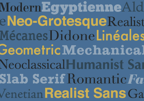
In the first installment of this two-part series on type classification, we covered the basics of type classification — the various methods people have used, why they are helpful, and a brief survey of type history, classifying and identifying typefaces along the way. Unfortunately, we only got as far as Roman (traditional serif) typefaces and the early-19th century. Now we’re back for part 2!
Part 2 will primarily cover sans typefaces, with a nod to display typefaces and other less common categories, as well as address a few of the questions people have about whether type classification is helpful and necessary.
If you haven’t read part 1, now’s your chance to go over it. It lays important groundwork for this article, covers the categories of serif typefaces, and contains plenty of useful information about the development of serif type. If you already have read it, here is a quick recap to get us started before we move on to the new material.

The Smashing Magazine 2013 Photo Contest: Winners And Best Entries


Three weeks ago we launched a photo contest and asked everyone to submit a creative picture of the object that fuels their creativity and inspiration. For all of you who have participated, thank you so much for taking the time and thought to interpret your object in a creative way. We did not only enjoy the brilliant photography that you sent us, it was also inspiring to read your thoughts on the story behind all these objects.
We received around 350 entries from all over the world and only 70 could make it onto the poster we’ve created exclusively for our dear fans.
As promised, the 10 most creative and original submissions will be awarded with a printed poster. The ones who have been selected will be contacted via email very soon — if not already! If you’ve followed our submission guidelines, your inspiring picture has surely made it to our jury. And if you find your object among the 70 pictures on the poster, you’ll see that your name has been included among the names of all the contributors that made this poster possible. Of course, the owner of each photo owns all the copyrights.

Adapting To A Responsive Design (Case Study)


This is the story of what we learned during a redesign for our most demanding client — ourselves! In this article, I will explain, from our own experience of refreshing our agency website, why we abandoned a separate mobile website and will review our process of creating a new responsive design.
At Cyber-Duck, we have been designing both responsive websites and adaptive mobile websites for several years now. Both options, of course, have their pros and cons. With a separate mobile website, you have the opportunity to tailor content and even interactions to the context of your users, whereas a responsive website means better content parity for users and a single website to maintain.